We’ve once again teamed up with the experts at Yumpingo to bring you their top tips and best practice advice to designing the perfect menu.

1 .Draw attention to your most profitable menu items
Studies have shown that on average it takes customers less than 2 minutes to decide what they want to eat on the menu. Because of this, drawing attention to your most profitable dishes will increase the likelihood that dish gets ordered within the short decision making time frame.
TIP: Highlight dishes by using coloured boxes, pictures or graphics, or by making the text coloured or bold.
2. Discover the Golden Triangle
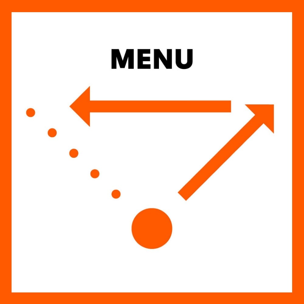
The Golden Triangle refers to the areas of a menu that draw our eyes’ attention first
- Our eyes start in the middle of the page
- Then move to the top right hand corner
- Then move to the top left hand corner
Because of this, you’ll want to make sure your most profitable, best tasting, or least complex dishes land in this section of the menu.
3. Re-order your menu items
Studies have found that a guest’s attention is drawn to the first 2 and last 2 dishes within each section of the menu. Make sure that within each section of your menu, your best and most profitable dishes are the ones that get these prime spots.

4. The Rule of 7
Research indicates that decision fatigue begins to occur in a menu category when there are more than 7 items. Use this principle determine which dishes should be grouped together into a category to help streamline the decision making process.
5. Get the price right
While price tends to be the driving factor for determining value perception, there are a few things you can do/avoid to increase value perception without changing pricing:
Do:
- List pricing discreetly: Pricing should be in the same font, colour, and alignment as the dish description to that the reader’s eyes can glaze over it as quickly as possible
- Use descriptive language: Studies have found that customers are willing to pay significantly more for dishes with value add menu descriptors. These can be location based (e.g. Norfolk bronze turkey, locally sourced, etc.), artisanal (e.g. hand tossed) or quality certified (e.g. DOP Mozzarella)
Don’t:
- Avoid pricing ending in .99: this gives of the perception of cheap or low quality
- Try removing the pound signs from your prices: these can remind customers that they are spending money and may make them more reluctant to order pricier items or cross sells like appetisers and desserts.

6. Have a separate dessert menu
If a customer sees an appealing dessert at the beginning of the meal, they will plan to order that dessert at the end. Because they already have this additional expense in mind, they are less likely to also order an appetiser or other add on.
